10 Farmhouse Living Room Paint color Ideas For your Home
Choosing the right color for your farmhouse-style home is one of the most important decisions you’ll make when it comes to creating that perfect, cozy atmosphere. The farmhouse style is all about warmth, simplicity, and a touch of rustic charm, so your color palette should reflect that. But with so many beautiful colors out there, how do you decide which ones are right for your space?
First, think about the mood you want to create. Farmhouse colors are typically soft and neutral, designed to make your home feel welcoming and lived-in. Whites, creams, soft grays, and muted greens or blues are all great choices. These colors work well together and can easily be mixed and matched throughout your home.
Next, consider how much natural light your rooms get. Lighter colors like soft whites and creams can make a room feel larger and more open, which is especially helpful in spaces with less natural light. On the other hand, deeper colors like navy or charcoal can add depth and create a cozy, intimate atmosphere, particularly in larger rooms or those with plenty of windows.
Don’t forget about your existing decor and furniture. The right color should complement what you already have, whether that’s vintage wood furniture, cozy textiles, or metal accents. Think about how the colors will interact with these elements, and choose shades that will enhance, not overpower, your farmhouse style.
Finally, it’s all about balance. You don’t need to stick to one color throughout your entire home; mixing different shades and tones can add interest and keep your space from feeling flat. Whether you’re painting walls, furniture, or even just adding accents, the key is to create a cohesive look that feels warm, inviting, and distinctly farmhouse.
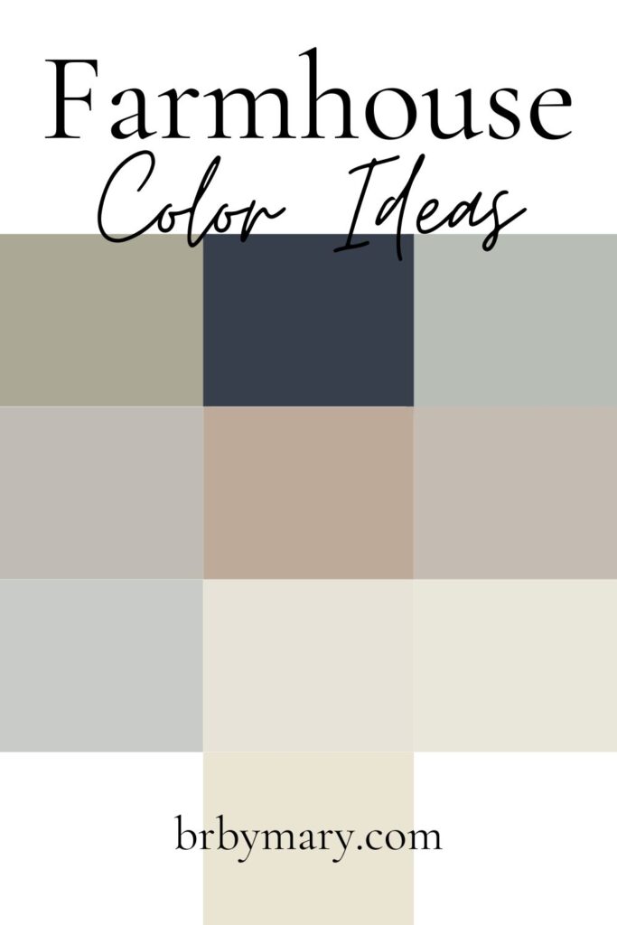
There are obviously hundreds of colors that could match a farmhouse style home. But that’s way too overwhelming! So I’ve picked my favorite farmhouse paint colors and shared them in this post. You can use this post as a starting point to finding the tones you love the best. Some have blue undertones while others have green or yellow undertones so they all give a different atmosphere even though they can be close in shade.
Sherwin-Williams – Alabaster (SW 7008)
Alabaster by Sherwin-Williams is a warm, soft white that has become a farmhouse classic for a good reason. This color is incredibly versatile and creates a calm and inviting atmosphere, which is exactly what a farmhouse style home aims to achieve. It has a creamy undertone that adds warmth, making your space feel cozy yet bright.
In a living room, Alabaster works beautifully on all the walls, especially if you want a clean, airy look that still feels comfortable and homey. It’s also a great choice for trim, ceilings, or even your fireplace mantel. If you’re considering repainting furniture, Alabaster is perfect for giving older pieces a fresh, timeless look. Imagine a distressed coffee table or a set of end tables in this color—they would blend seamlessly with the rustic vibe of a farmhouse living room.
You can also use Alabaster to repaint smaller accents like picture frames or lamp bases. It’s neutral enough to serve as a backdrop for other colors and textures in your space, but it also has enough warmth to stand on its own, making your living room feel effortlessly elegant.

Benjamin Moore – Revere Pewter (HC-172)
Revere Pewter by Benjamin Moore is a light gray with warm undertones, making it a fantastic choice for a farmhouse-style living room. This color is incredibly popular because it acts as a perfect neutral backdrop, adding just the right amount of warmth without feeling too beige or too cool.
In a living room, Revere Pewter is ideal for all the walls, creating a soothing environment that pairs well with natural wood elements and cozy textiles. It’s especially effective in spaces that receive plenty of natural light, as it reflects light beautifully without feeling stark. If you prefer to use it on just one wall, it also makes an excellent accent color behind a statement piece like a vintage cabinet or a gallery of family photos.
Furniture painted in Revere Pewter can also tie the room together nicely—think of a bookshelf, a sideboard, or even your TV stand in this color. It pairs well with whites, blues, and earthy tones, making it easy to incorporate into an existing color scheme. Revere Pewter is truly a versatile, timeless shade that can add subtle sophistication to any farmhouse living room.

Farrow & Ball – Cornforth White (No. 228)
Cornforth White by Farrow & Ball is a subtle, warm gray that fits perfectly into farmhouse interiors. It’s a color that feels calm and composed, offering just enough contrast to white trim or furniture without overpowering the room. Cornforth White has a sophisticated, understated charm that works well in any space where you want a cozy, lived-in feel.
In a living room, Cornforth White can be used on all the walls to create a serene, neutral backdrop. It’s a wonderful choice if you have wooden beams or floors, as the soft gray tone complements the natural wood without clashing. If you prefer to keep most of your walls white or off-white, consider using Cornforth White on an accent wall or in an alcove to add depth to the room.
You could also consider painting larger furniture pieces like a console table, a coffee table, or even built-in shelves in Cornforth White. This color looks great with both warm and cool tones, so it’s easy to incorporate into your farmhouse decor, whether you prefer more traditional or modern elements. Cornforth White adds a gentle touch of color while keeping the overall look light and inviting.

Behr – Swiss Coffee (12)
Swiss Coffee by Behr is a creamy off-white that’s perfect for adding warmth and brightness to your farmhouse-style living room. This color has a soft, buttery undertone that makes any space feel welcoming and cozy, yet it’s still light enough to keep your room feeling airy and open.
In a living room, Swiss Coffee works beautifully as the main wall color, especially if you want to create a warm, inviting atmosphere. It pairs wonderfully with natural wood tones, soft fabrics, and vintage decor, making it a versatile choice for a farmhouse setting. If you’re looking to add contrast, you could use Swiss Coffee on the walls and pair it with slightly darker or more saturated trim or accent colors.
Furniture in Swiss Coffee can add to the cohesive, warm look of your living room. Consider repainting an old bookshelf, a pair of side tables, or a coffee table in this creamy hue. You could also use it for smaller accents like picture frames or cabinet handles to subtly tie the room together. Swiss Coffee is a timeless color that enhances the farmhouse style with its warm, comforting presence.

Sherwin-Williams – Sea Salt (SW 6204)
Sea Salt by Sherwin-Williams is a soft green-gray that brings a touch of color to your farmhouse living room while remaining beautifully neutral. This shade is perfect if you want to introduce a bit of subtle color without overwhelming the space. It has a calming, tranquil vibe that can make any room feel more serene and welcoming.
In a living room, Sea Salt can be used on all the walls to create a soothing backdrop that pairs well with natural wood tones and white trim. It’s especially lovely in rooms that get a lot of natural light, as the color can shift slightly with the changing light throughout the day, adding depth and interest to your space. If you prefer a more layered look, try using Sea Salt on an accent wall, particularly in a room with lighter neutral tones elsewhere.
You can also incorporate Sea Salt into your furniture choices. A painted coffee table, sideboard, or even an accent chair in this soft green-gray can add a fresh, relaxing feel to the room. It’s a versatile color that pairs well with other farmhouse staples like wicker baskets, woven rugs, and vintage-inspired decor, making it a great addition to your living room.

Benjamin Moore – Simply White (OC-117)
Simply White by Benjamin Moore is a crisp, clean white that’s perfect for farmhouse trim, cabinetry, and more. This shade of white is bright without being harsh, making it a versatile and timeless choice for any farmhouse-style living room. It has just enough warmth to feel inviting while still offering that clean, fresh look that many people love.
In a living room, Simply White works beautifully on all the walls if you’re aiming for a light, airy feel. It’s also an excellent choice for trim, doors, and baseboards, providing a clean contrast to darker walls or wood tones. If you prefer to add some color, you can use Simply White on your furniture—think of a crisp white coffee table, a bookshelf, or even built-in cabinets to brighten the room.
Simply White also pairs well with other farmhouse colors and materials. You can combine it with soft grays, muted greens, or even deep blues for a balanced look. It’s a great base color that allows your other decor elements—like rustic wood accents, vintage finds, and cozy textiles—to really stand out. Whether you use it as a main color or an accent, Simply White is a staple for any farmhouse living room.

Valspar – Silver Fox (7006-23)
Silver Fox by Valspar is a warm greige that complements wood tones and adds depth to any farmhouse-style living room. This color is a great blend of gray and beige, offering the best of both worlds: the modern appeal of gray with the warmth of beige. It’s a versatile color that works well as a neutral backdrop while still adding a bit of interest to the space.
In a living room, Silver Fox is perfect for all the walls if you want a sophisticated yet cozy atmosphere. It’s especially effective in rooms with natural wood elements, as it enhances the warmth of the wood without competing with it. If you prefer a more subtle touch, consider using Silver Fox on an accent wall or even in a small nook or built-in shelving area.
For furniture, Silver Fox is a great choice if you’re looking to repaint a larger piece like a media console, sideboard, or even a set of dining chairs. It pairs beautifully with other farmhouse elements like woven baskets, metal accents, and plush textiles, creating a harmonious and inviting space. Silver Fox is a color that can anchor your room while still allowing other elements to shine.

Sherwin-Williams – Comfort Gray (SW 6205)
Comfort Gray by Sherwin-Williams is a muted greenish-blue that adds a touch of color to your farmhouse living room without overpowering the space. This color is perfect for creating a calm, relaxing atmosphere while still keeping the room light and airy. It has a subtle warmth that makes it versatile enough to work with a variety of other colors and materials.
In a living room, Comfort Gray can be used on all the walls for a serene, cohesive look. It pairs well with white trim and natural wood tones, making it a great choice if you’re looking to add some color while maintaining that classic farmhouse feel. If you prefer to use it more sparingly, try painting just one wall or an accent area, like the space around a fireplace or behind a piece of statement furniture.
Comfort Gray also works beautifully on furniture pieces. Consider painting a coffee table, side tables, or even an accent chair in this soothing color. It complements other farmhouse staples like vintage finds, woven rugs, and cozy textiles, adding a touch of color while still keeping the overall look balanced and inviting. Comfort Gray is a versatile color that can help bring your farmhouse living room to life.

Benjamin Moore – Hale Navy (HC-154)
Hale Navy by Benjamin Moore is a deep, rich navy blue that adds a bold contrast to farmhouse neutrals. This color is perfect for making a statement in your living room while still fitting within the cozy, welcoming vibe of farmhouse style. Hale Navy is both classic and modern, offering a touch of sophistication that pairs beautifully with rustic elements.
In a living room, Hale Navy is ideal for an accent wall, especially if you want tocreate a focal point in the room. Imagine using Hale Navy on the wall behind your sofa, or perhaps on a wall with built-in shelving or around a fireplace. This deep blue color adds depth and drama to the space while still feeling timeless and elegant.
If you’re feeling bold, you can also use Hale Navy on larger furniture pieces like a bookcase, an armoire, or even your coffee table. It pairs beautifully with lighter neutral colors like white, cream, or soft gray, creating a striking contrast that anchors the room.
In addition to walls and furniture, you can incorporate Hale Navy in smaller accents, such as throw pillows, blankets, or even picture frames. This color is versatile enough to work with various materials and textures, from rustic wood to metal accents, enhancing the farmhouse style while adding a touch of modern flair. Hale Navy is the perfect choice if you’re looking to infuse your living room with a rich, sophisticated color that still feels cozy and inviting.

Farrow & Ball – French Gray (No. 18)
French Gray by Farrow & Ball is a soft greenish-gray that adds understated elegance to any farmhouse-style living room. This color is unique because it shifts slightly depending on the lighting and surrounding colors, offering a subtle, ever-changing beauty. It’s a muted, calming hue that perfectly complements the natural elements often found in farmhouse decor.
In a living room, French Gray can be used on all the walls for a soothing, cohesive look that creates a serene environment. It’s particularly beautiful in spaces with lots of natural light, as it brings out the soft green undertones. If you’re not ready to commit to all four walls, consider using French Gray on an accent wall or on built-in cabinetry to add a touch of color without overwhelming the space.
This color also works wonderfully on furniture. Think about painting a vintage dresser, a set of shelves, or even a dining table in French Gray. It’s neutral enough to work with a variety of other colors and materials, making it easy to incorporate into your existing decor. French Gray pairs beautifully with natural wood, white trim, and soft textiles, creating a harmonious, inviting farmhouse living room. Whether on walls, furniture, or smaller accents, this color brings a subtle sophistication that enhances the overall farmhouse aesthetic.

More Like This
- 25 Creative Living Room Graduation Party Ideas for a Memorable Celebration
- 25 Creative At-Home Graduation Party Ideas for a Memorable Celebration
- 25 Creative Garage Graduation Party Ideas You’ll Love
- 25 Creative Graduation Party Table Ideas You’ll Love
- 20 Stunning Floral Graduation Party Ideas for a Memorable Celebration
— SAVE THIS POST —
Did you like this post? If you liked this post, don’t hesitate to share it!
Want to save this post? You can pin the following images on pinterest to save this post.
We are Mary and Eric, the founders of Be Right Back, a blog dedicated to romance around the globe and at home.
We are Mary and Eric, the founders of Be Right Back, a blog dedicated to romance around the globe and at home. With over 10 years of experience in dating and traveling to romantic places, we share our favorite date ideas and romantic destinations to help couples level up their relationships. Having lived in and traveled through the USA, we also share our favourite things to do in the States.
With 70,000 monthly readers and 16,000 followers on social media, Be Right Back is your go-to resource for romantic trip ideas and couple activities at home and abroad.